We stand with Ukraine and our team members from Ukraine.

A Community Of Over 740,000

Home ›› Interface and Navigation Design

Interface and Navigation Design

Read these first

Banking and finance have dwelled in an ivory tower throughout their history.

Article by Adam Fard
Fintech UX Design Trends for 2023
  • Many banks are implementing innovative solutions to make the user experience not only effective but also fun.
  • The article covers the following fintech-driven trends:
    • gamification;
    • product identity;
    • centralization;
    • fully mobile banking;
    • social banking;
    • data visualization;
    • human language.
Share:Fintech UX Design Trends for 2023
5 min read

Everything you need to know about what makes a button great.

Article by Domas Markevicius
Designing the Perfect Button
  • Buttons are one of the main UI elements in interactive design and most businesses measure their success by button clicks.
  • The author covers the principles for a good button design at Wix:
    • Making a button clear
    • Making a button findable
    • Making a button identifiable
    • Maintaining clear, predictable and simple text
    • Using single icon buttons with caution
    • Minding hierarchy and emphasis
Share:Designing the Perfect Button
6 min read

Exploring chat options can be daunting but here are some UX considerations for when refreshing or building your chatbot design.

Article by Michelle Lee
Considerations for your chatbot design

Chatbot design has specific UX considerations to create exceptional conversations. In this article, the author recommends making sure to:

  • Be conscious of the size and placement of sticky chat elements
  • Keep the chat feature accessible without relying on a sticky chat element
  • Avoid non-user initiation of chat dialogs
  • Encourage users to search for information with an FAQ or navigational assistant prior to using live support
  • Be clear about how the user should engage with the chatbot, and adjust messaging for offline hours
  • Particular attention has to be paid to sticky chat elements, feature accessibility, pop-ups, navigation and offline assistance.

Read the full article for a breakdown of how to pay attention to these details while getting started with conversational design.

Share:Considerations for your chatbot design
4 min read

How default settings are essential to providing better customer experience and diminish users’ decision fatigue.

Article by Rohith M S
The UX of default settings in a product
  • Default settings play a much bigger role in our experience with products than we may realize.
  • Learning how to use new products might be strenuous and this is often aggravated by decision fatigue experienced by users.
  • By providing pre-selected values default settings ease customers experience and eliminate the inconvenience of wasting time on selecting all the preferences autonomously

Read the full article to learn more about how to design for default settings.

Share:The UX of default settings in a product
6 min read

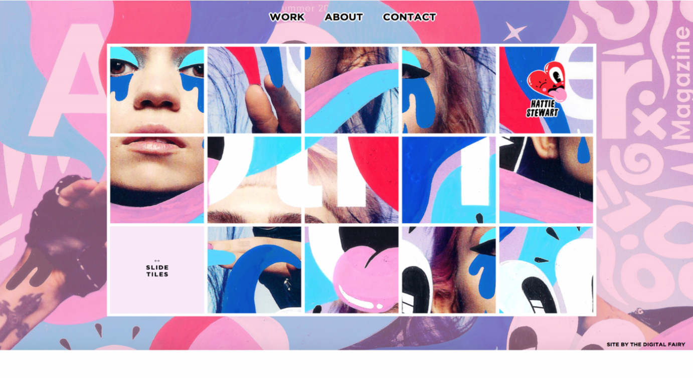
How adopting maximalist design can differentiate a brand and help users to identify with it.

Article by Catriona Campbell
User Experience— ‘Less is More’ vs ‘More is More’
  • In contrast to minimalism, maximalism in UX is characterised by the use of multiple colours, patterns, images, forms, etc. Its motto is “more is more”.
  • Numerous brands adopt a minimalist approach as they consider that it can simplify users’ navigation.
  • However, maximalist design can also improve overall UX and make a brand stand out among competitors.
Share:User Experience— ‘Less is More’ vs ‘More is More’
3 min read

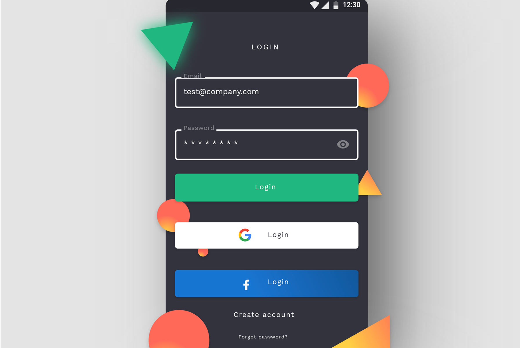
When deciding on your app’s login method, choosing between security and user convenience is a balancing act. Here are best practice login options and their metrics.

Article by Joseph Russell
App login design: Choosing the right user login option for your app
  • When deciding on your app’s login method, choosing between security and user convenience is somewhat of a balancing act. This article explores some options and the pros and cons of each.

  • There are 4 common options to consider when designing an app login screen: an email with password login and registration UX, social and third-party login UX, mobile login and registration UX, multi-factor login and registration UX.

    • Password login. Passwords are common but it can be hard for the user to remember all passwords. That is why security breaches could be caused by using password managers and using the same password for various apps/sites.
    • Social login and third-party login. Users are grateful for having one less password to memorize, and developers happy with high conversions and all the data they receive asses to. This method is mobile-friendly and free to use. But developers have to rely on the 3rd party security and expect to lose users who do not trust social media.
    • Mobile number login. The mobile number tends to be a much more unique identifier, and this method doesn’t require the user to remember passwords. On the other side, mobile numbers could change, and migrating accounts becomes complicated.
    • Multi-factor authentication (MFA). Its main strength is security. You can find temporary pins, third-party authenticator apps, retina, biometrics, or fingerprint, among MFA methods. Often, it requires a second device that can be stolen.

    Read the full article for a more in-depth breakdown of each login option.

Share:App login design: Choosing the right user login option for your app
9 min read

This website uses cookies to ensure you get the best experience on our website. Check our privacy policy and